- Web & Mobile
INKPAY Website
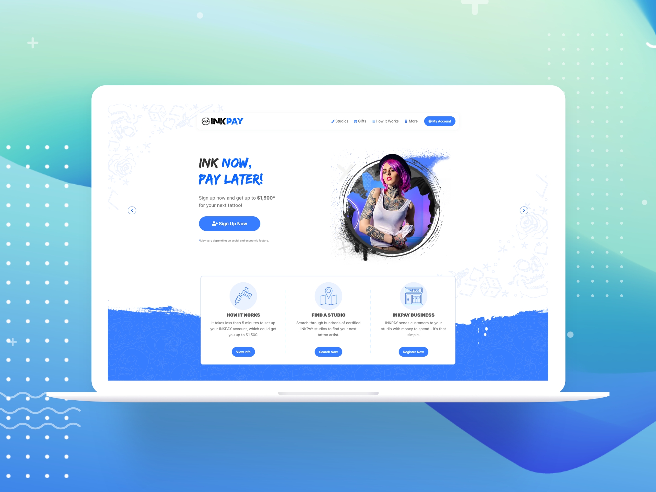
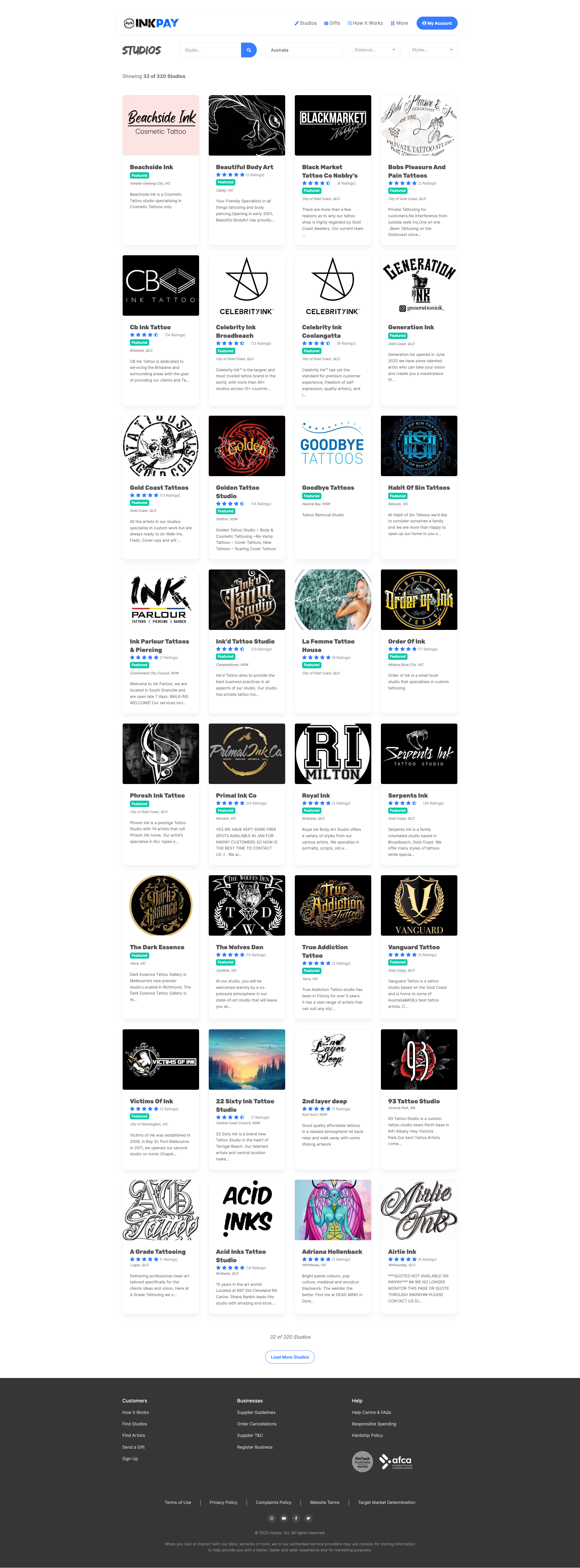
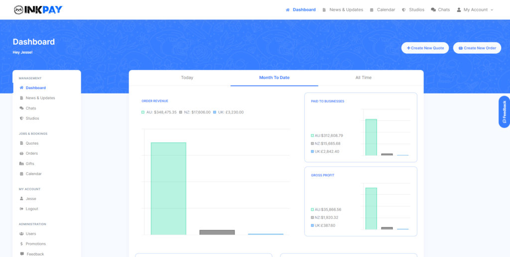
I managed the UI/UX for Inkpay, the leading Buy Now, Pay Later Fintech company for Tattoo's in AU, NZ and UK. The product is designed for both User and Studio with an order, chat and quotes system.
- 50k+ Visitors per month
- 240k+ Total Users
- 40k+ Total Orders
- 1.4k+ Businesses registered

The Challenge
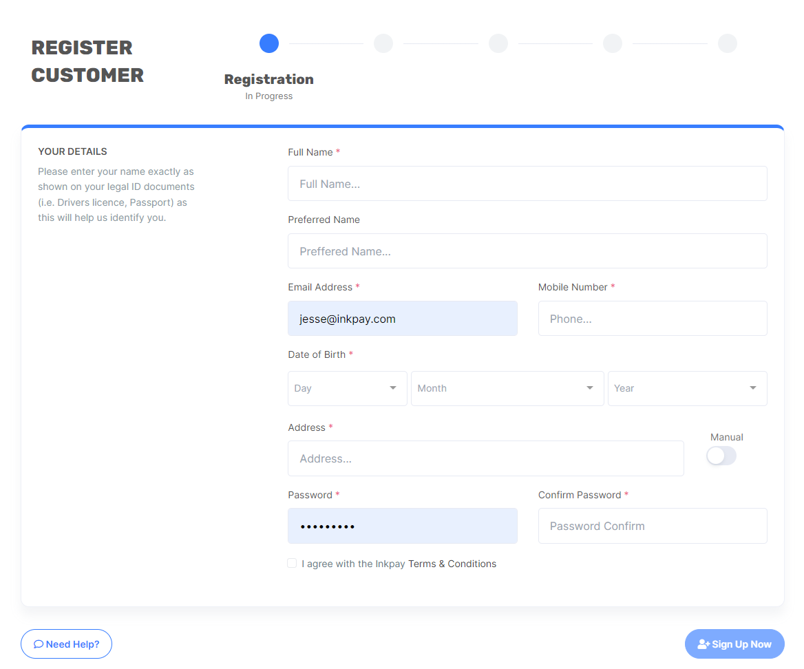
The INKPAY website was in desperate need of a facelift. With basic structure and an unclear user flow, the site suffered a clear path for both Users and Studios. The site also nested several forms that were causing major usability issues and would often result in an incomplete signup. The navigation menu needed a quick path to the right page rather than combining user and studio needs altogether.
My Role
As the Lead UI/UX designer on this project, I led the design and liaised with the development team while researching and building the new user flow. I did extensive research into the issues the general user was having, created wireframes and prototypes while including management and the development teams feeback. I delivered final assets and component libraries, showcased the live product and made adjustments according to the live data.
Research and Review
User Interviews
As I joined a project that was already live in its initial state, it was important to gather additional feedback on other usability issues that weren’t so glaringly obvious. As the backend was also used by both Studio’s and Support Staff, I needed to listen to their feedback to better understand some of the pain points of the website that were causing problems for the users. Through doing so I was able to empathise with the user and start working with the development team to design new features and quality of life changes to the site.
Analytics and User Testing
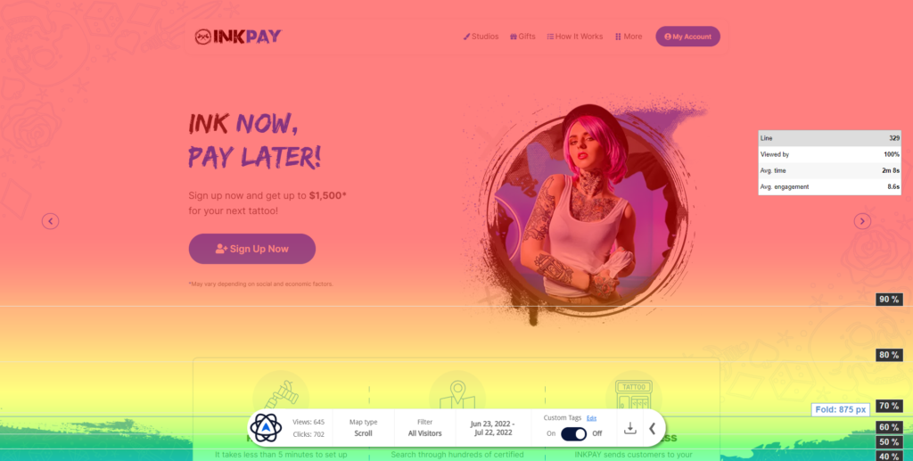
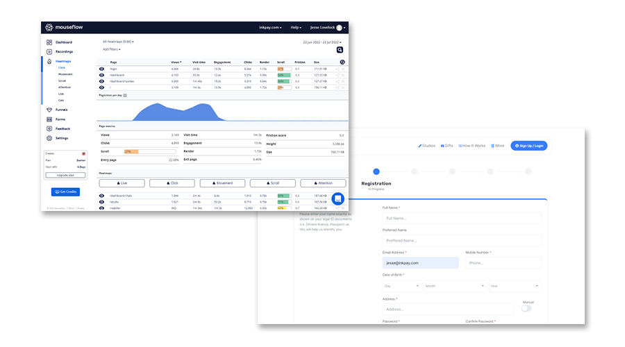
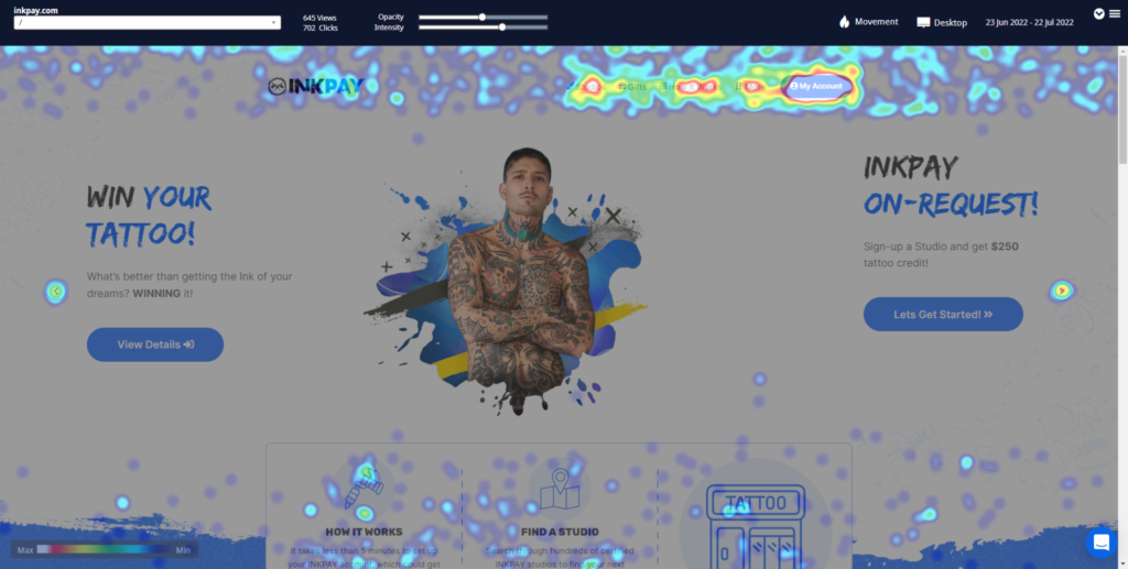
The website had little to no analytics or user tracking besides Google Analytics which was only set up for marketing purposes. Discovering the user journey through heatmaps and recordings was key in understanding which areas of the website needed the most attention and changes. The user testing was conducted using Mouseflow utilising the large userbase and allowing me to view the regular users frustrations with the current site.
UX Inspiration Research
Now that we knew what were the major issues of the site, we looked at other businesses in the Buy Now, Pay Later industry to find inspiration and best current practices. The goal was to find alternate and possibly better solutions that we could test and expand upon for the betterment of the user. Klarna and Humm were the standouts, with an easy approach and clear user journeys.
Putting the Research to use.
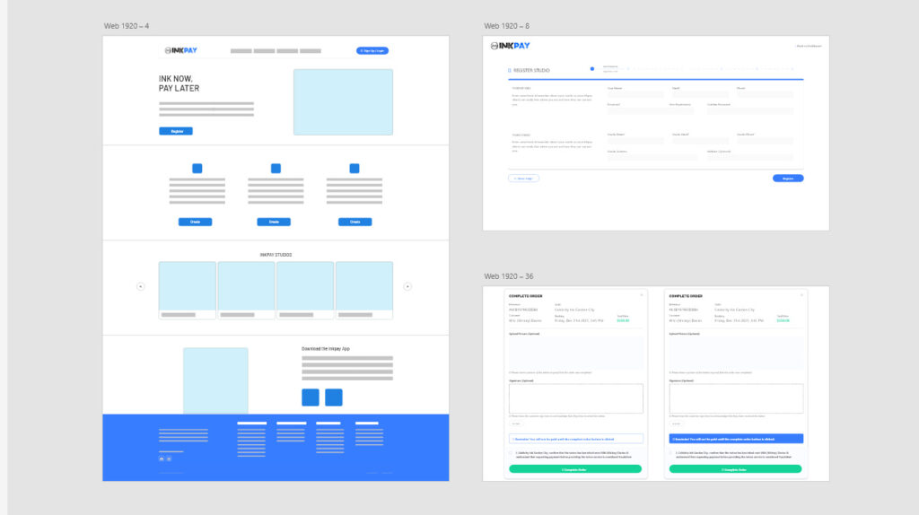
Wireframes
As I joined a project that was already live in its initial state, it was important to gather additional feedback on other usability issues that weren’t so glaringly obvious. As the backend was also used by both Studio’s and Support Staff, I needed to listen to their feedback to better understand some of the pain points of the website that were causing problems for the users. Through doing so I was able to empathise with the user and start working with the development team to design new features and quality of life changes to the site.
Prototyping
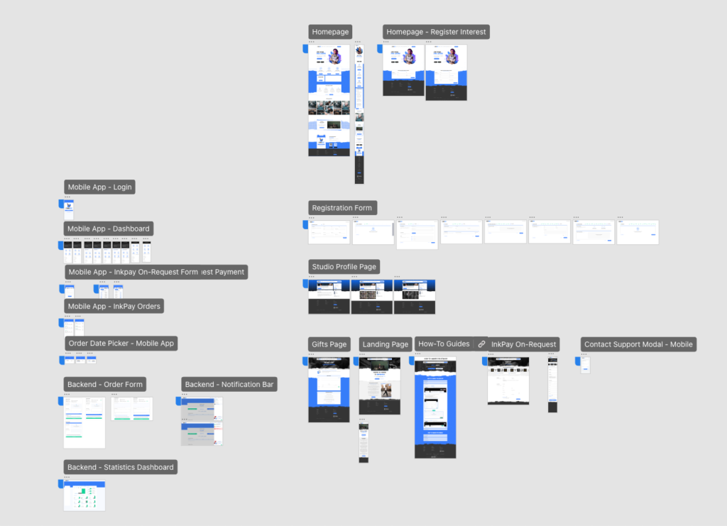
Using Adobe XD, the prototype of the website started to be built along with the component library. This was a key element in creating the new look and feel for the website after building on several different versions of an initial design.
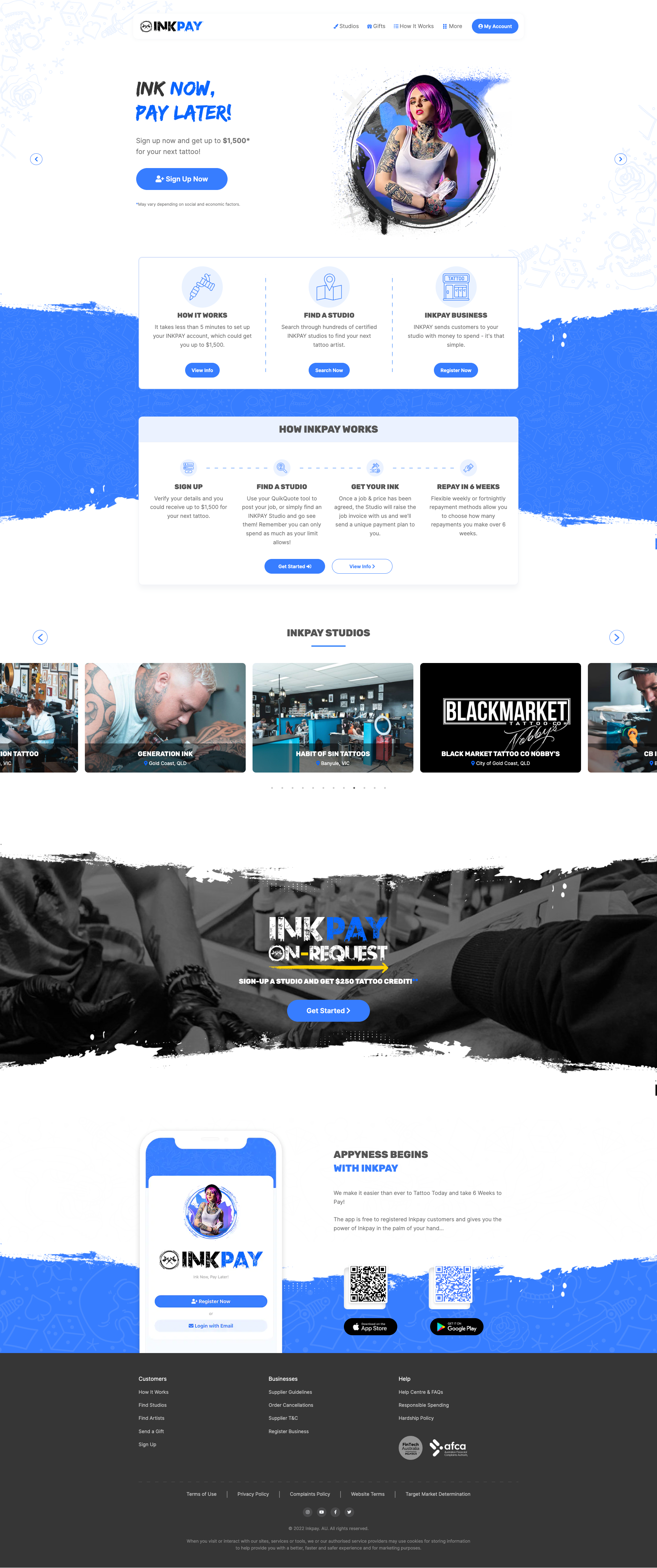
It needed to be clean but keep a personality of being a business targeted towards the Tattoo Industry. Keeping the Ink stroke elements and subtle “drawn” animations gave the website character without being a detriment to keeping the site feeling clean and easy to read.
Development
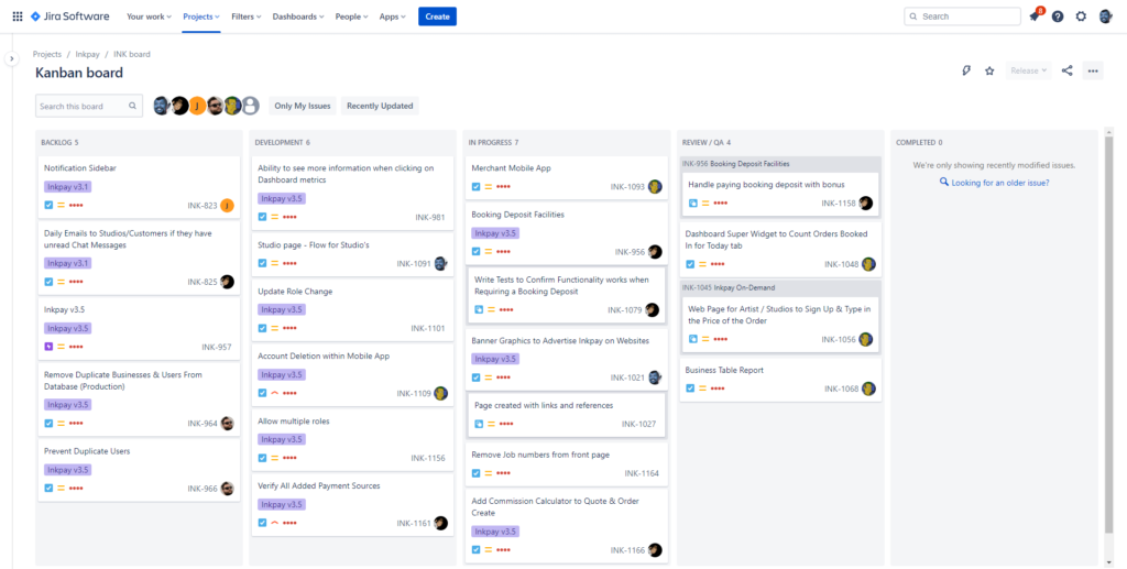
Using Jira, we were able to plan out each feature and build, putting priority on each item. This was a great process to be a part of as the development team had a great line of communication with me when one of us would get stuck or needed more mockups/information for a certain feature.
Being part of a well organised team, planning out pages, content and features, helped keep this project on task and as a result build a better product.
Results
Better Sign-Up Rate
As a User and Studio on Inkpay, you have to be verified before you can request an order or accept an order, one of the pain points of the site previously was the Customer or Studio quitting half way through to form due to unclear instructions and a lack of details. We streamlined the form to be easier to understand, be clear about what you need, how many steps you have left and an easy way to contact support if you get stuck.
The results were great to witness through the recorded user journeys, seeing the user clearly understand what was required and continue passed where users previously would quit. This also resulted in less support tickets for the sign-up process now that it was more user friendly.

Users were more interactive
Previously, it was common for a lot of INKPAY users to quit 2 or 3 pages in due to not being able to find what they were after.
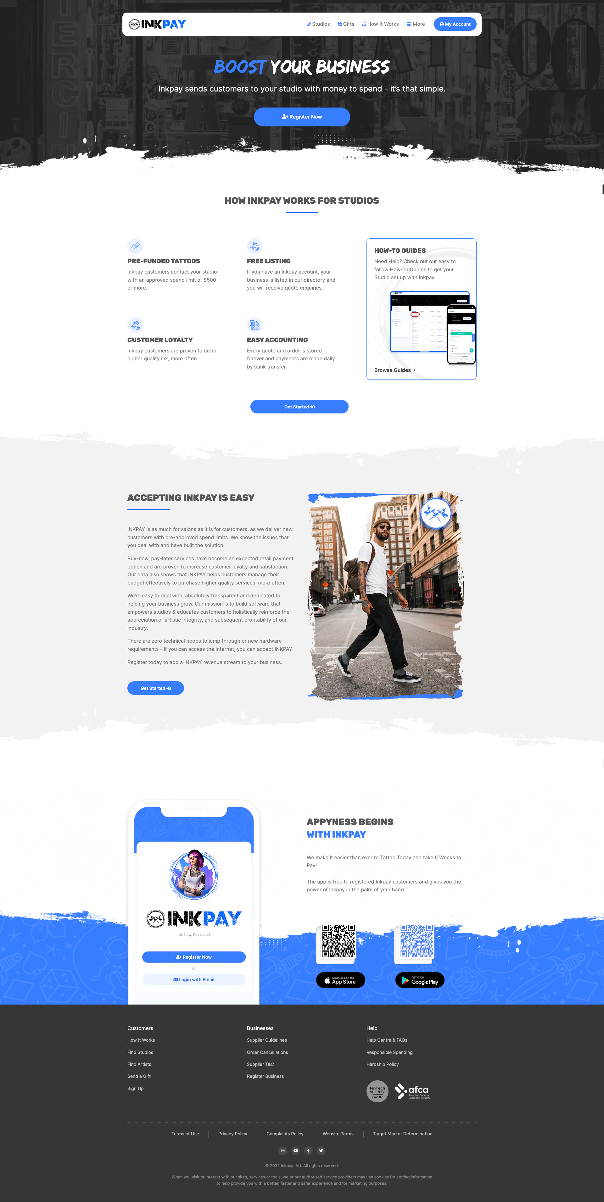
With the new navigation on display and with a clear indication of who each page is targeting (User/Studio), we saw a much higher site visit time and click rate which meant Users would find their desired studio or information they were after and Studio’s would usually land on the “Register Business” page.
Studio's complete their Studio page
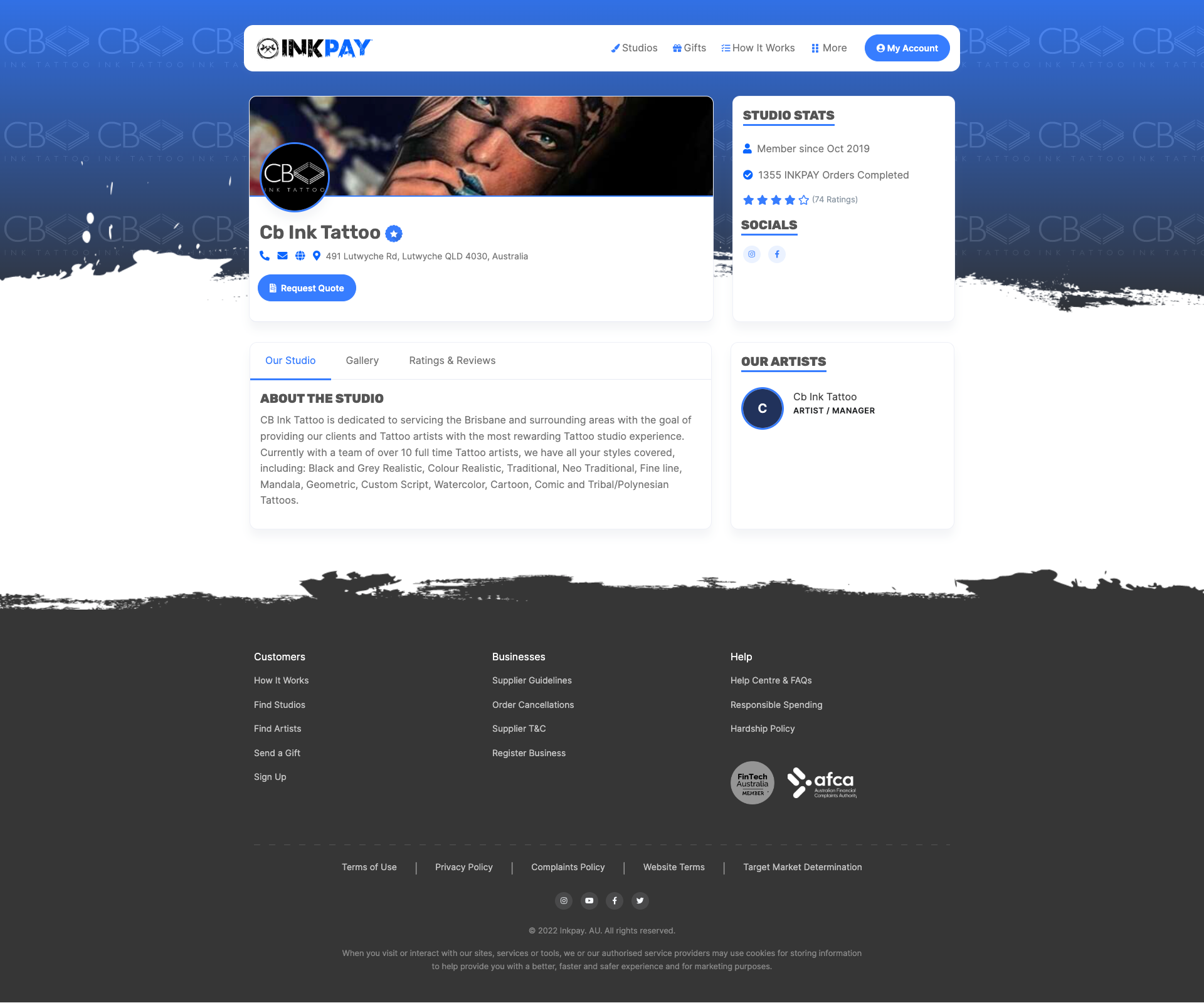
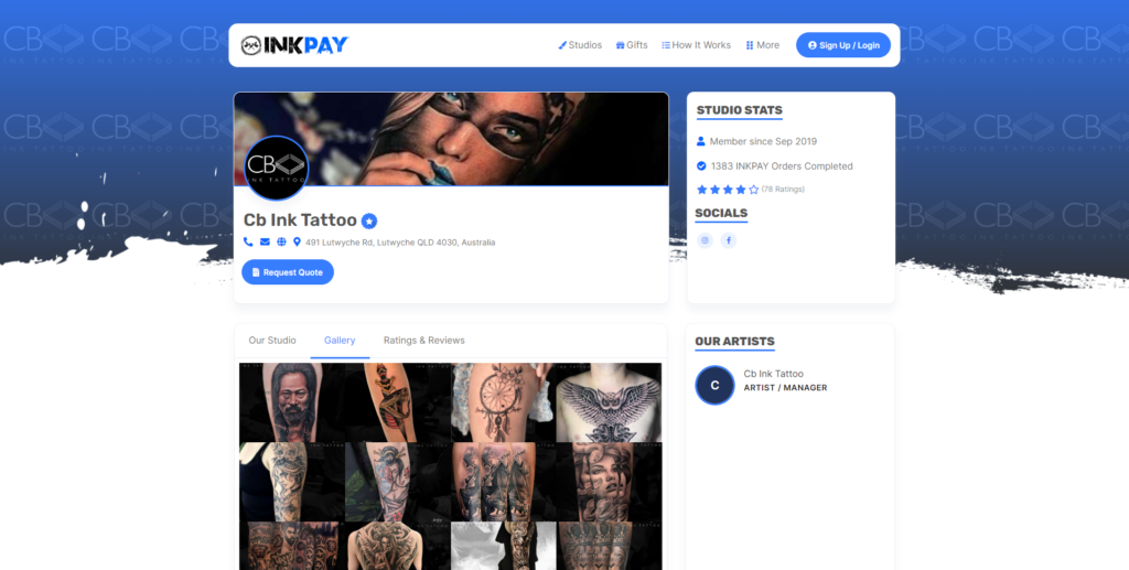
Through upgrading the form and revamping the Studio page, the Studio’s found more incentive and an ease of access to upload their profile picture, studio banner and a gallery of their work.
This in turn helps bring more clients due to having a complete presence on the INKPAY website and being discovered by clients who would have previously skipped over the Studio.
Post Launch Feature Updates
After the launch, me and the development team continued to launch features that helped users connect to the studios.
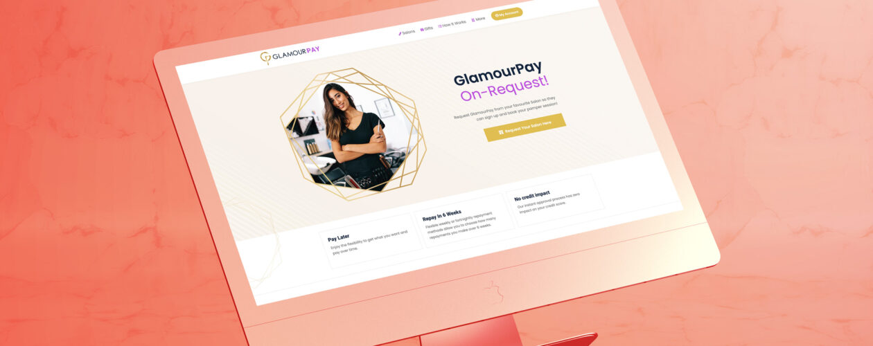
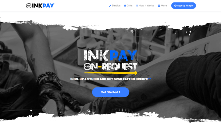
One of these features being "Inkpay On-Request" which allows the User to send a request to their favourite Studio to join INKPAY, this helped serve as a funnel for the Sales and Support team to then reach out to the Studios to get them onboard. To date this feature has been used by Users hundreds of times and continues to be used daily.

