- App Design
InkPay App
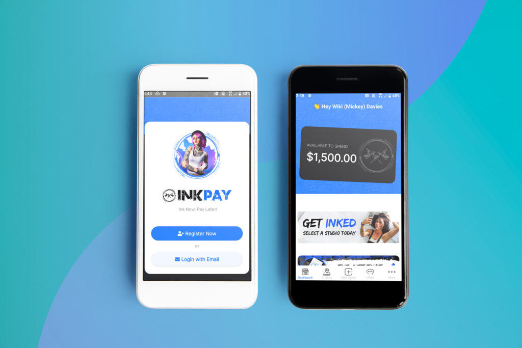
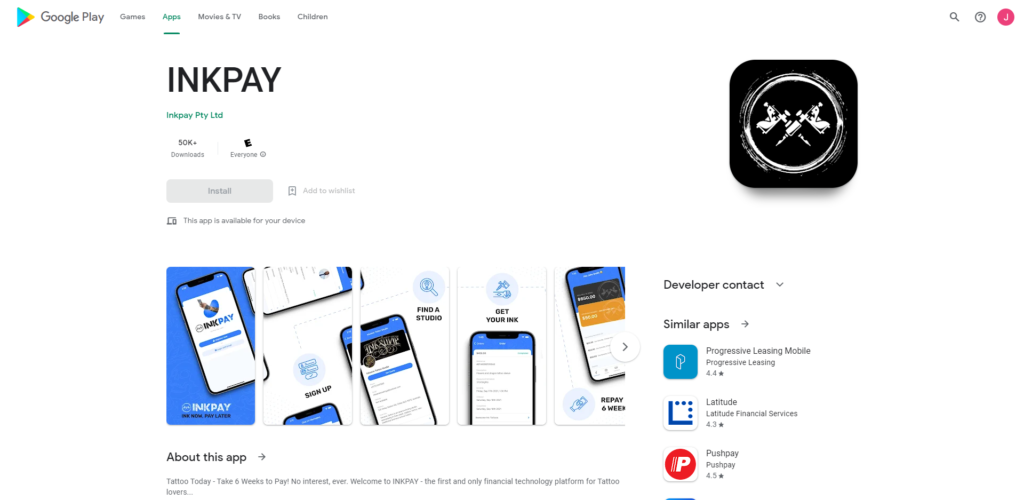
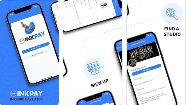
I managed the UI/UX for Inkpay, the leading Buy Now, Pay Later Fintech company for Tattoo's in AU, NZ and UK. They required an app for their growing user base.
- Old App, New Look
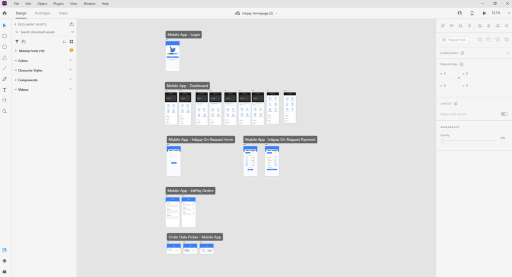
- Designed with Adobe XD

The Challenge
The app had already been built before I started with INKPAY but needed some extra love and care for its UI and UX features.
With the company not wanting to scrap what had been built and start again, there was a real challenge in trying to make small tweaks and changes that could bring a design and userflow facelift to the product.
My Role
As the lead UI/UX designer, I teamed up the talented devs at InkPay to update the app to be more user friendly and have more functionality to help with the userflow and experience.
Research and Review
Pain Points and Quick Wins
As the development for this project had already been underway for some time and several versions had already been released to the app stores. I researched some of the issues users seemed to have with the app and came up with some “Quick wins” and solutions on how we could move forward with the app.

Planning the Design
Wireframes and Prototyping
These mostly came as required by the CTO and Developees, as they had been working on the app before I started here, they already had a clear project timeline and what they needed to be designed and mocked up.
While working with the team, I was able to come up with some quick and easy updates to the layout to help usability and design.

Development
The biggest issue we ran into was the limited ability the developers had with Vue Native. This required me to design around these restrictions and put the users experience at the forefront.
Although the app didn’t turn out as pretty and polished as I would have hoped and as clean as my initial designs, its feedback from User’s was a lot more positive and added extra features that were being requested.


