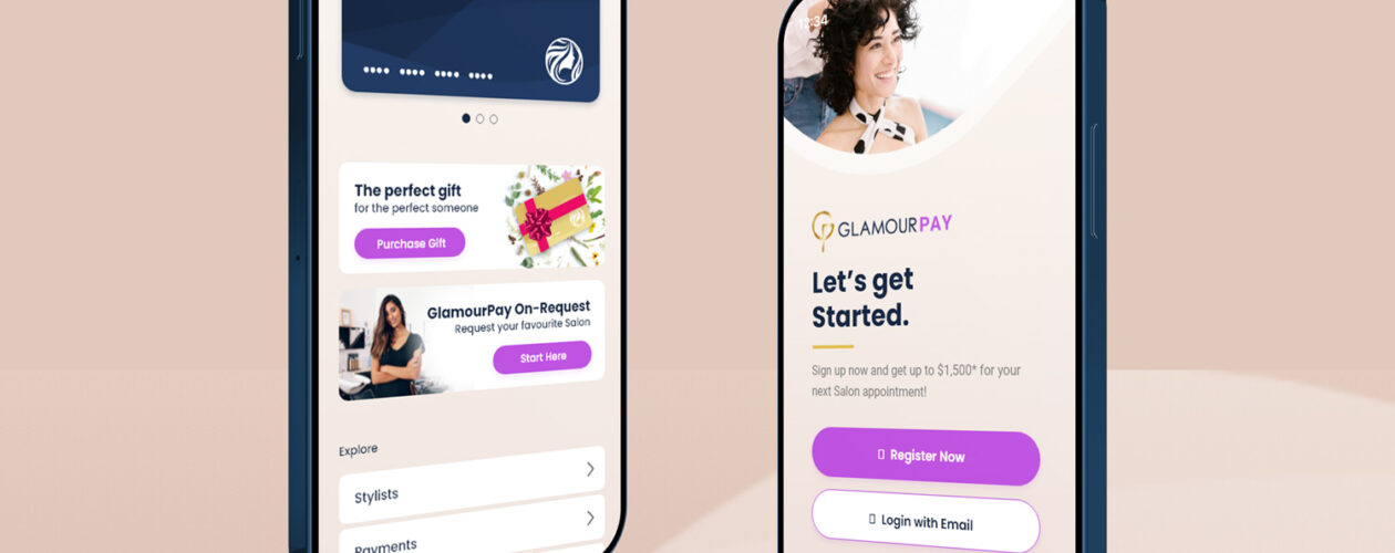
- Web & Mobile
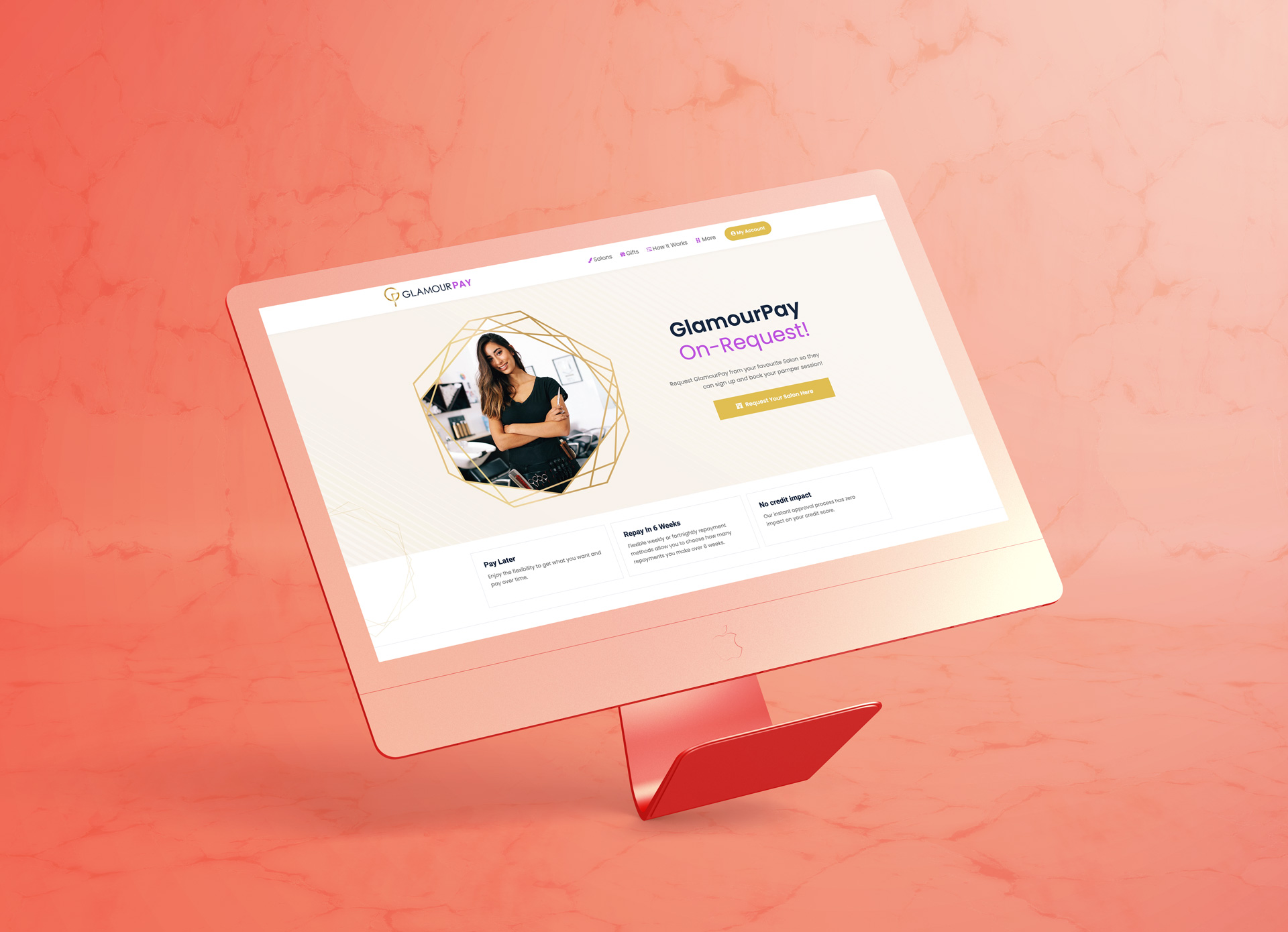
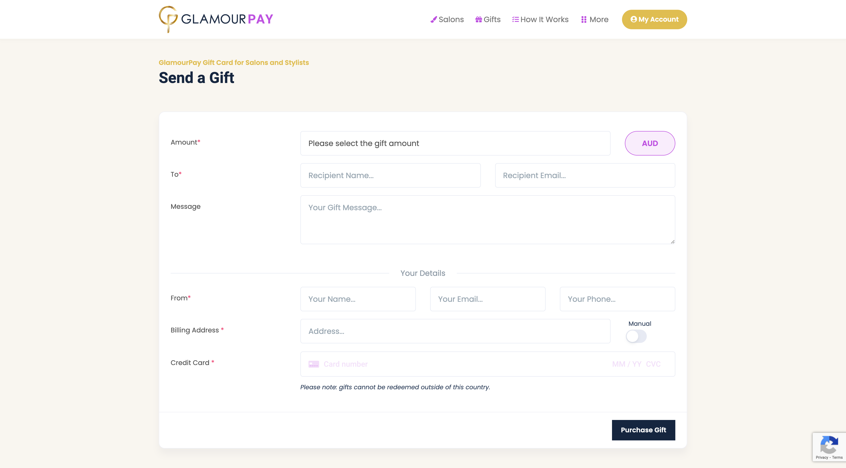
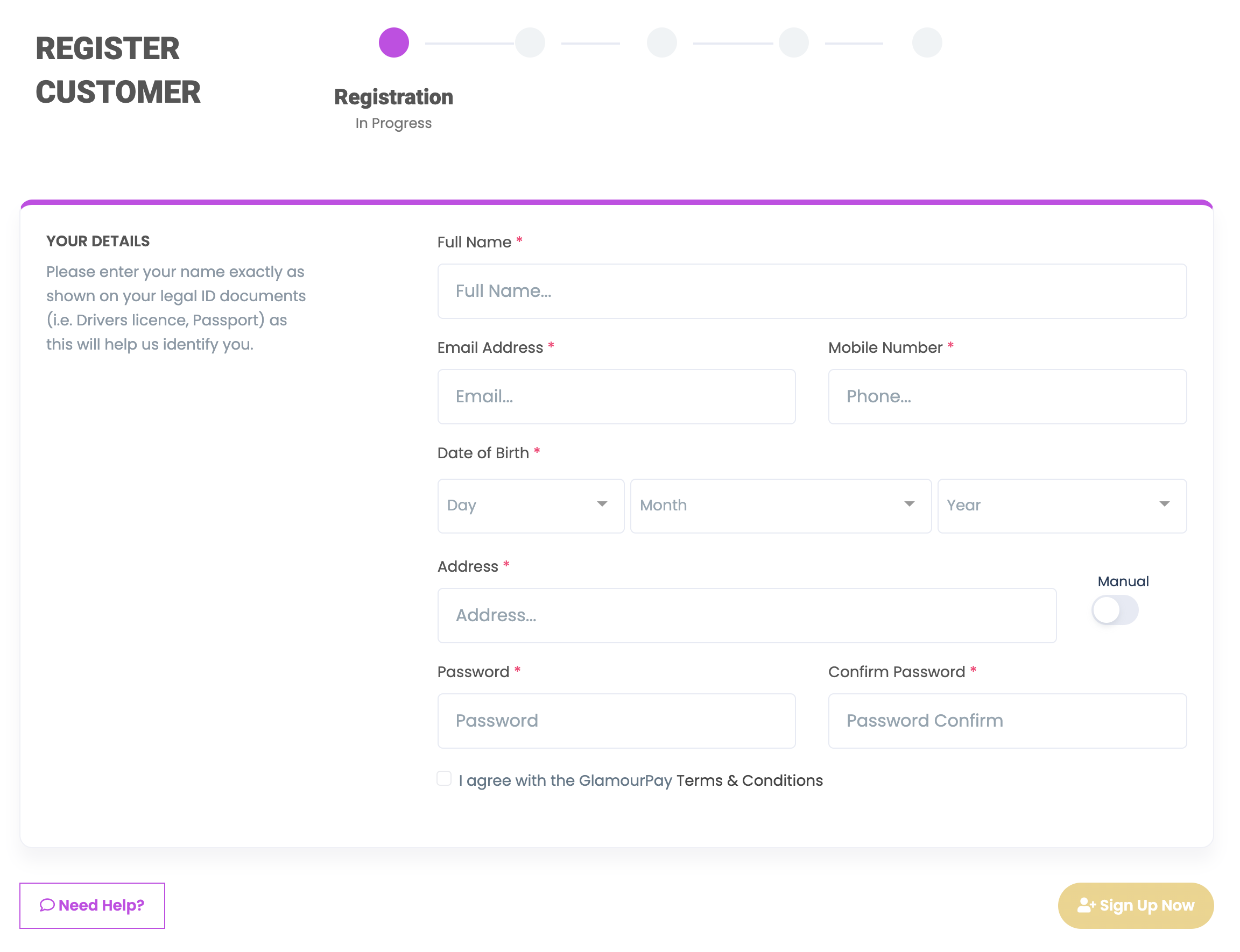
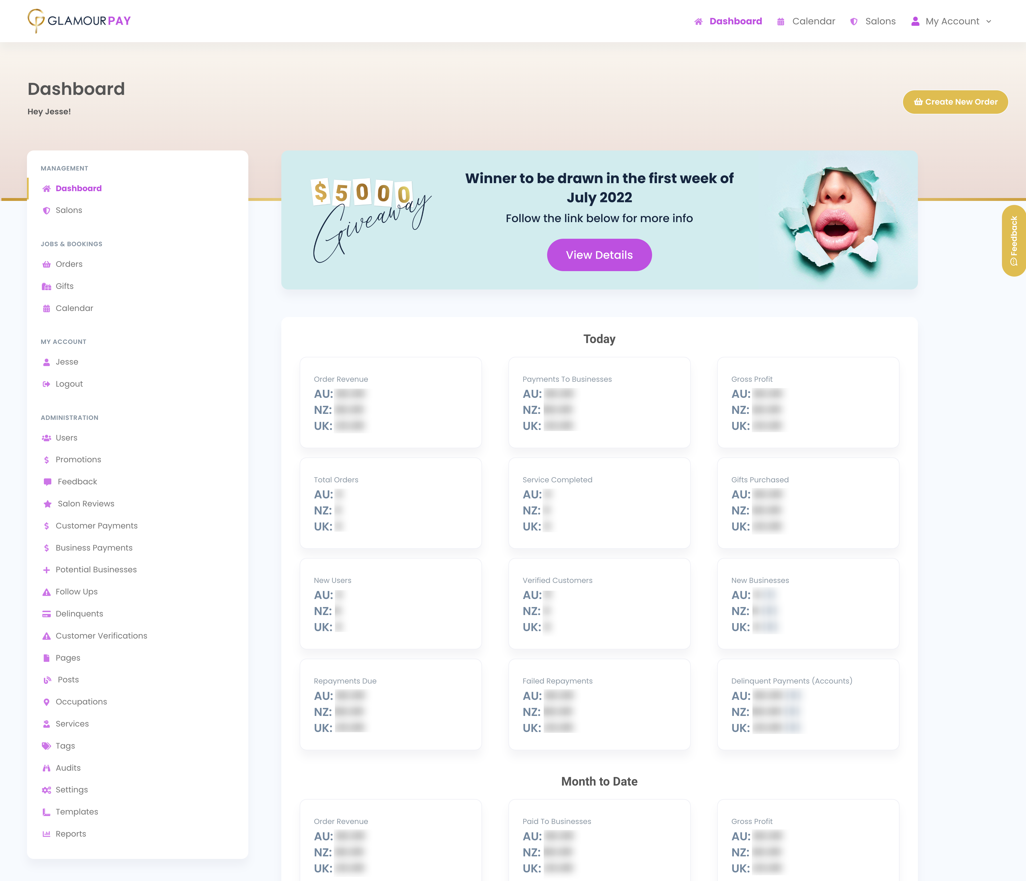
GlamourPay Website
I was the Lead for the UI/UX for GlamourPay, a new FinTech child company of INKPAY. This product offers a Buy Now, Pay Later solution to both Customers and Salons.
- Brand New Startup
- Built on Laravel and Vue.JS

The Challenge
As this was a new company, we had to create a new website and conduct proper research to facilitate the needs of both customer and business owner.
Stepping into new territory that I was unfamiliar with, the Beauty Industry, research and user journey planning was key in the execution of the site.
My Role
I was the sole designer on this project, I was in charge of the overall design and research, working along side the development team. I conducted thorough research into the Beauty industry and created wireframes and prototypes with the user first in mind. After the launch I continued to make adjustments adhering to the incoming user data and analytics continuing a smooth user journey for any visitor.
Research and Review
Industry Research
As this was a brand new industry to me, I needed to do extensive research into the requirements and needs for both Users and Salons. As the site covered everything from Hair Salons, Nail Salons, Cosmetic Tattoo’s and Makeup Artists, we needed an easy way to choose and select what type of appointment and service you were after. The sites target demographic was a 18 – 35 year old female who on average would spend $150 to $300+ per salon visit.
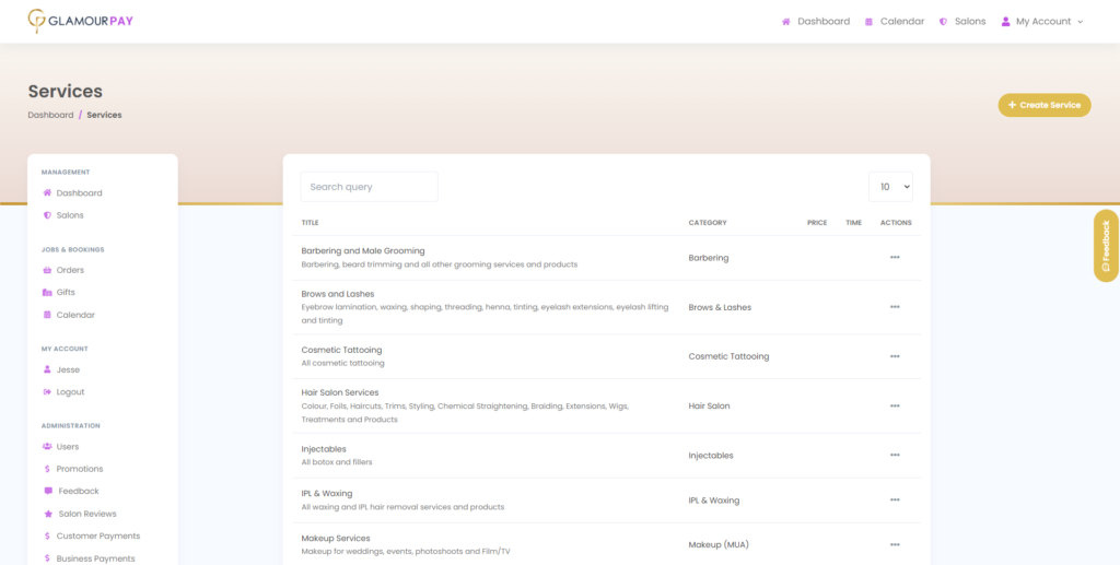
Utilisation of a tested Userflow
As this was a child company of INKPAY, we wanted to utilise the already established database full of users and keep the sites tested user functionalities.
Keeping the User Journey similar would help keep the familiarity that INKPAY customers crossing over are already accustomed too, as the User Journey had already been tested and updated due to user feedback and recordings on INKPAY, we knew that this was the best way to plan out the flow of the site.
Planning the Design
Wireframes
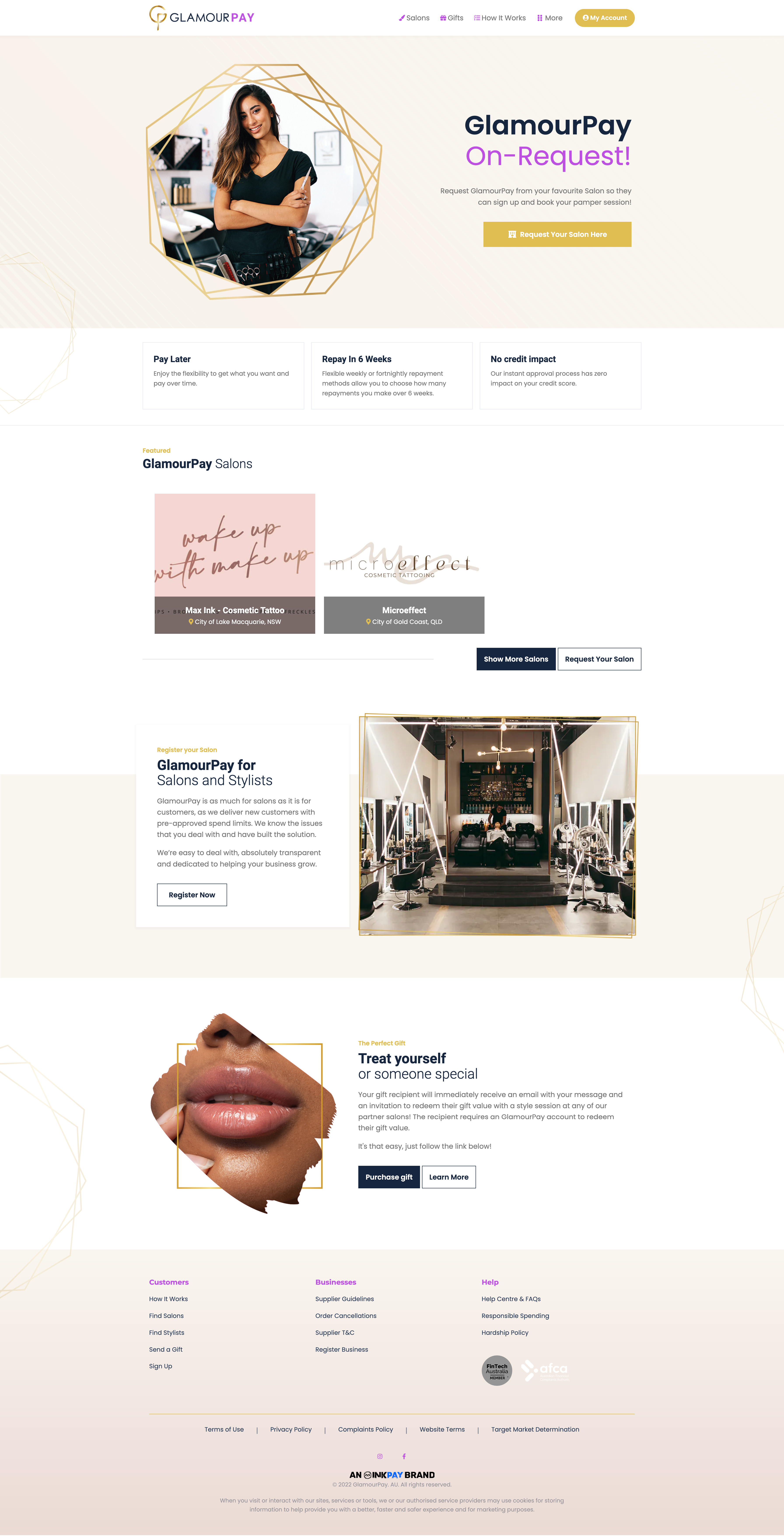
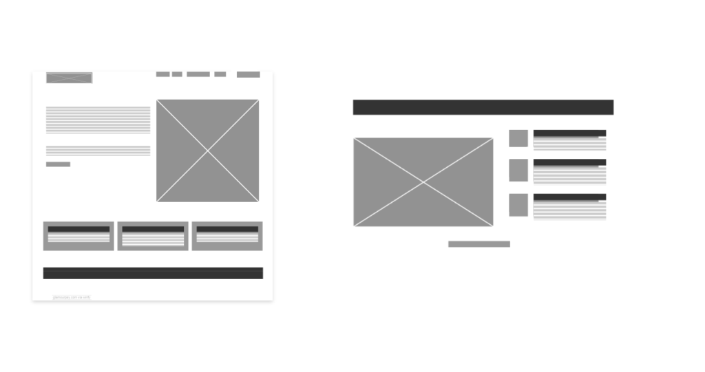
We kept the similar layout of INKPAY as we knew it worked, making small tweaks and streamlining a few elements in the layout really helped with the final clean aesthetic of feeling like you were entering a Salon.
Prototyping
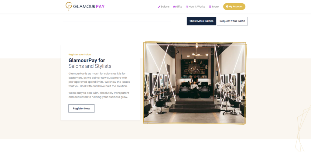
After the wireframes, the design started to come together, a hiccup I initially found with the first design I made was that although the layout was somewhat different each page, they all felt relatively the same and rather static and lacking character.
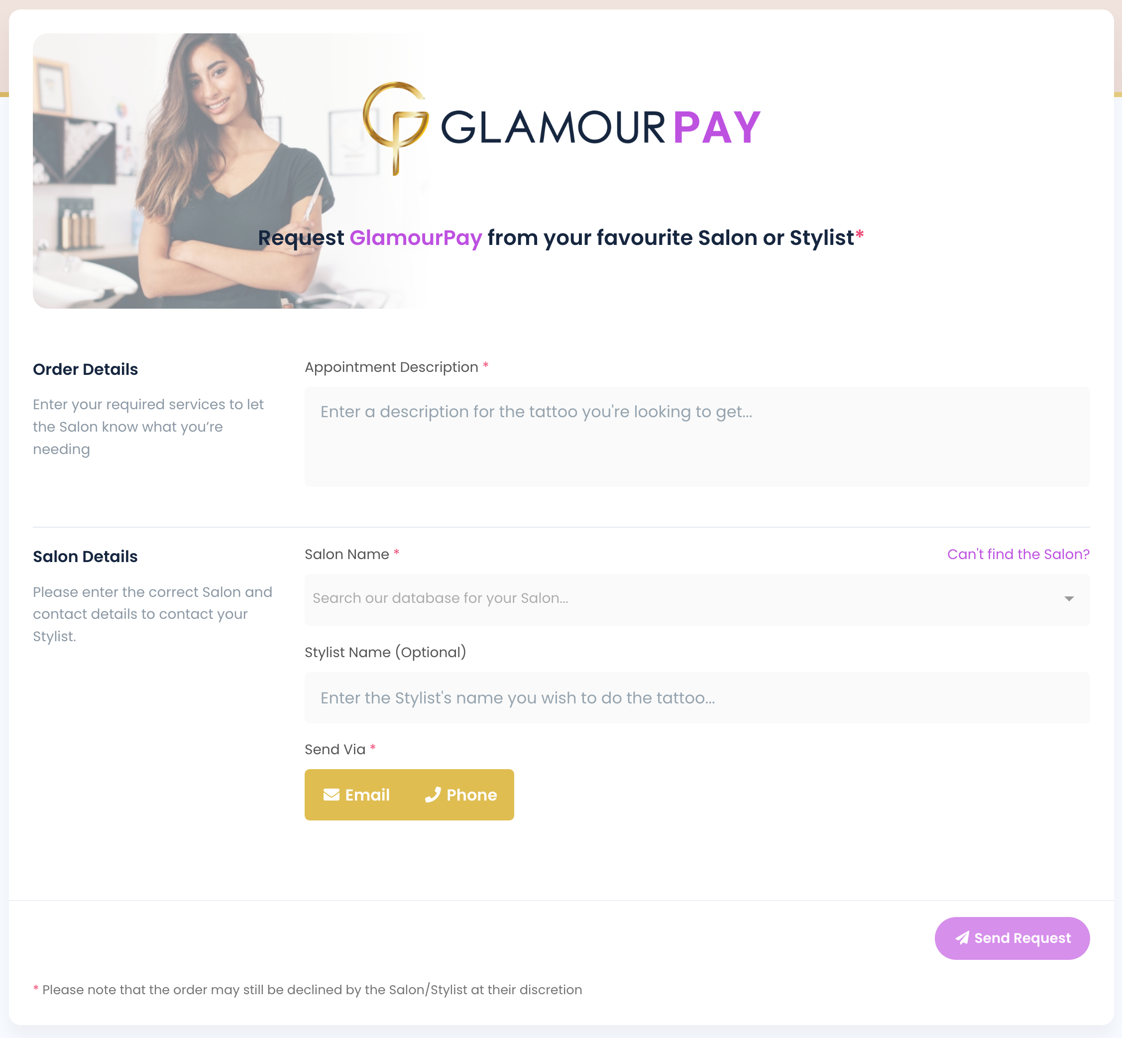
This was fixed in the next prototype by changing the layout on certain pages hero section and adding animations to certain elements of a page that would instantly draw your eye and get the user engaged in the content. It helped keep the site to have its own personality overall while still making the user feel like they are on a brand new page.
Development
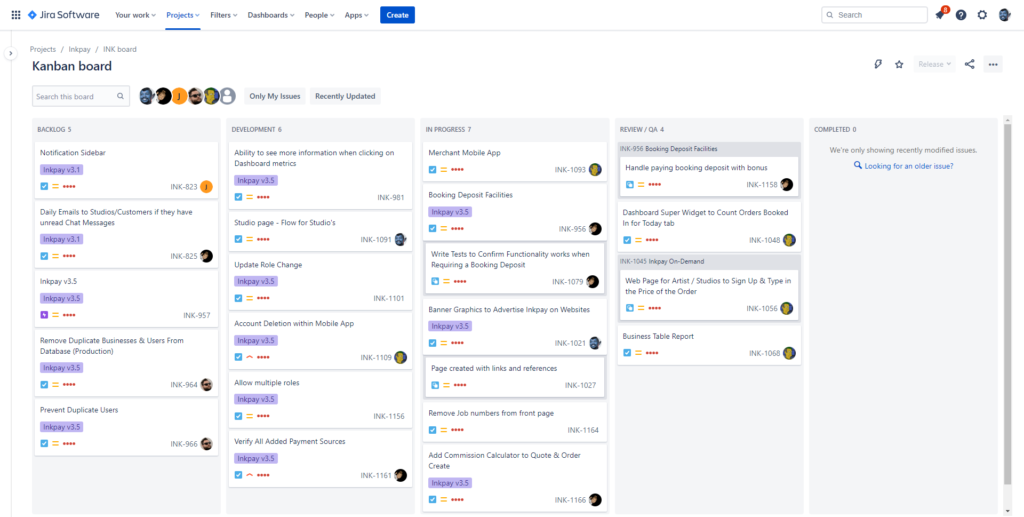
Having gone through this process for INKPAY, the team already had a perfect solution for keeping on task and prioritising features and pages, Jira once again proved to be a great workflow tool.
Working to our strengths with having a solid team with great communication was overall the key reason we were able to build this site from the initial wireframing to live site in just under 2 months.
