Product Designer
Senior Product Designer focused on UI/UX, accessibility, and user-centered systems, with strong skills in illustration and motion design.


My Skills
Ranging from Gaming Engines, UI/UX programs (Figma/Miro) to Adobe suite and Spine, I have skills with most programs a Designer would use.
User Interface and Experience
Researching User Analytics and creating User Stories, I create Interfaces for Games, Apps and Web based projects.
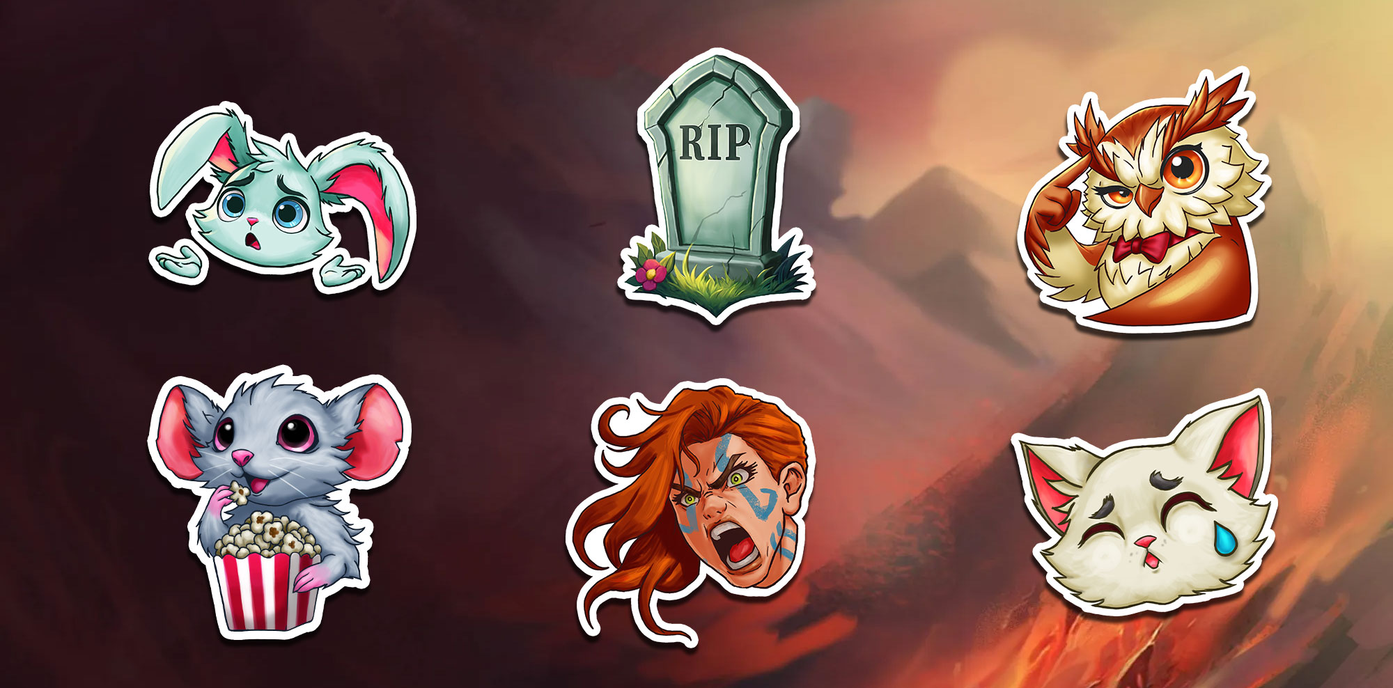
Illustration and Concept Art
Using both digital and traditional media, I love to illustrate to help bring worlds and projects to life. Ranging from concept art to UI Icons and Logo's.
Motion Design and VFX
Whether it's prepping a character for animation rigging or creating VFX for UI and In-game assets, I have the skills to offer a helping hand.
My Experience
Jesse Lovelock
I’m a Senior Product Designer with 10+ years of experience designing across web, gaming, and Web3 platforms. I thrive in fast-moving environments and enjoy turning complex systems into clear, usable experiences.
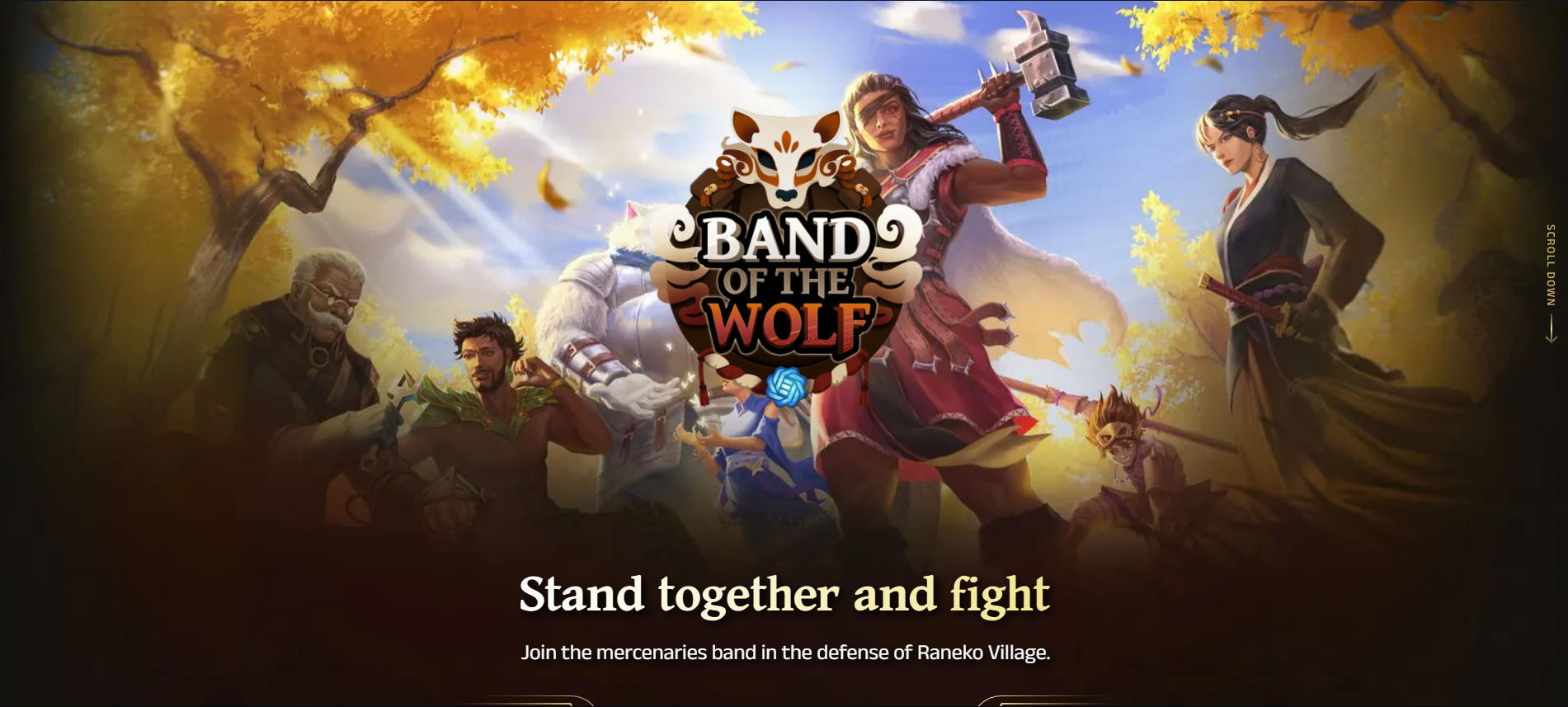
Revision3 (2025)
At Revision3, I worked as a Senior UI/UX Designer on Web3 games, gaining deeper experience with Spine animation and designing clear, fast, and responsive UI/UX for short-form, gameplay-driven experiences.
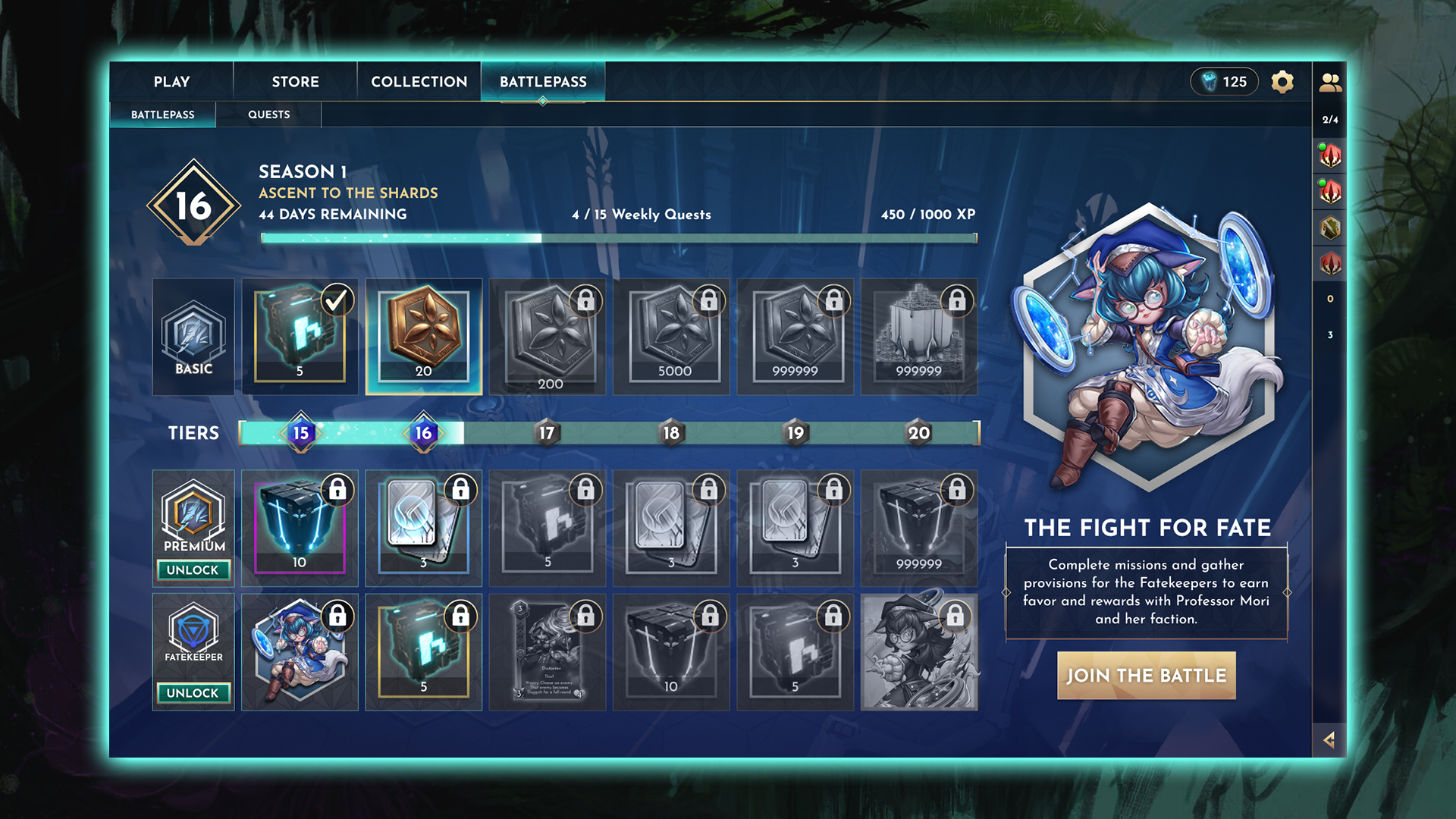
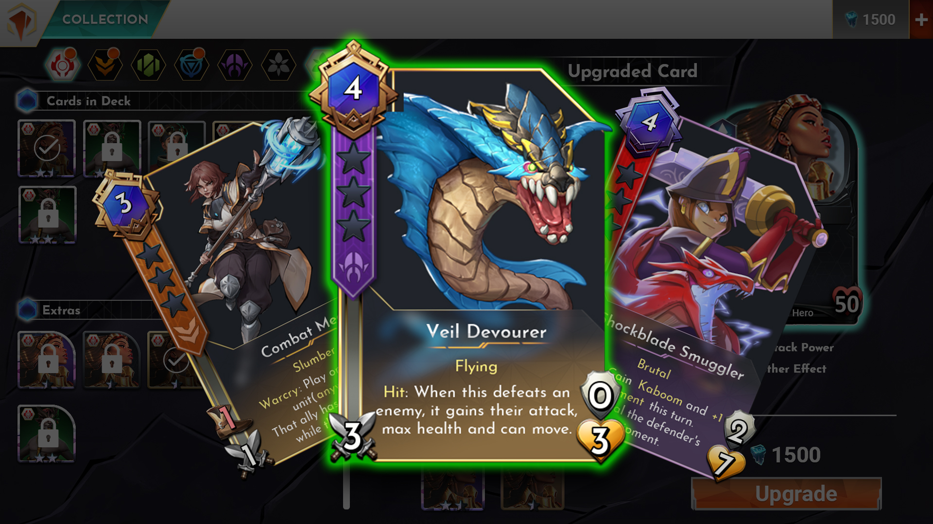
Shardbound (2023-2024)
Working on Shardbound at Bazooka Tango introduced me to Unreal Engine workflows and designing UI for a complex tactical card game. Collaborating with a highly experienced team helped shape a UI that felt distinctive without sacrificing usability.
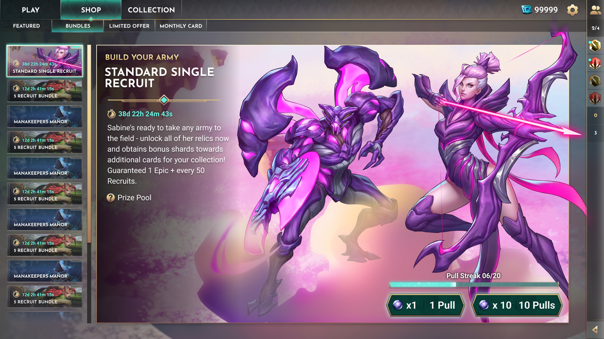
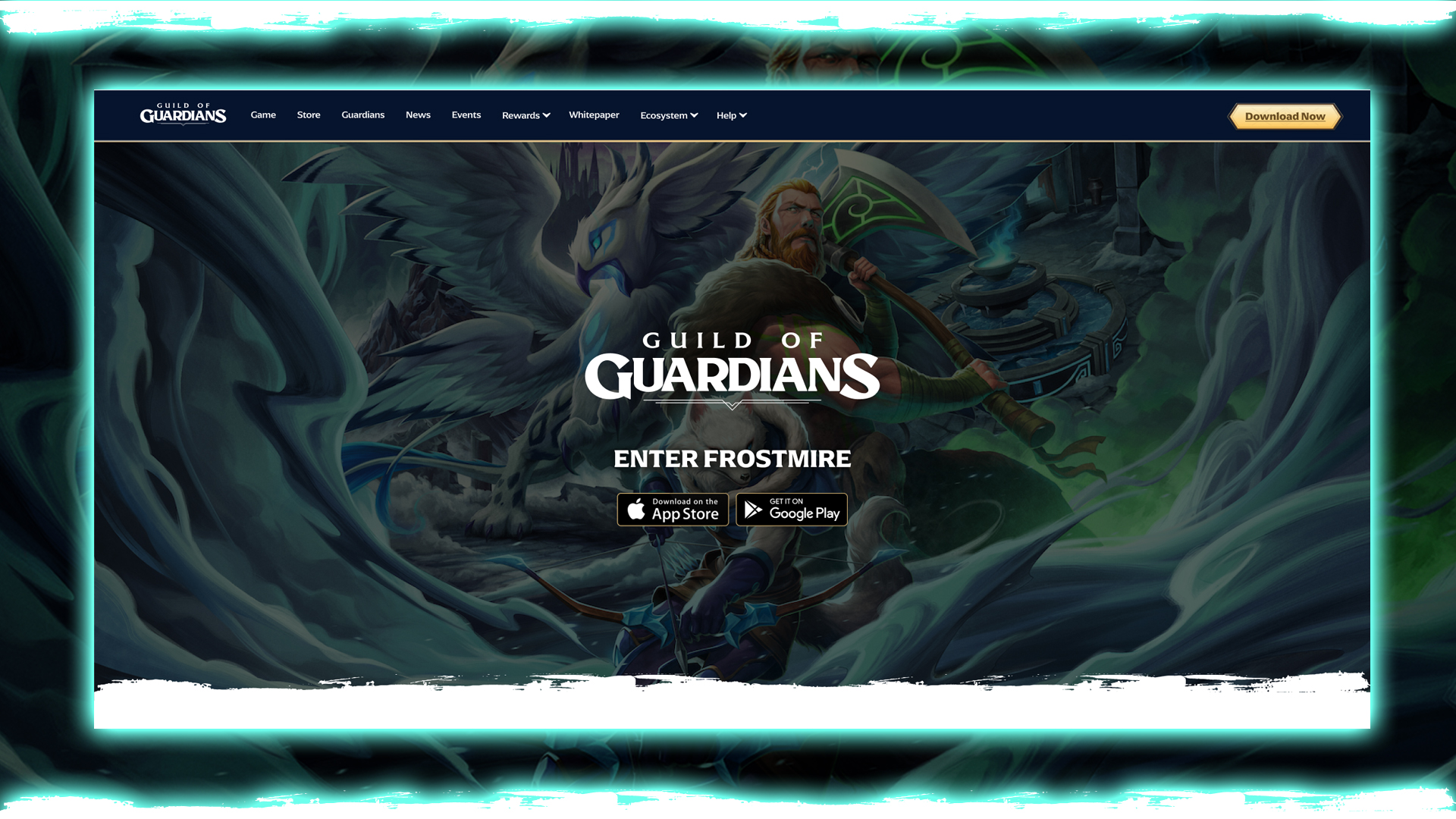
Guild of Guardians (2023-2024)
While working on Guild of Guardians, my first mobile Web3 RPG, I designed UI/UX systems that helped surface complex information clearly and fluidly. This was critical in a game featuring 80+ Guardians with varied skills, attributes, and rarities.

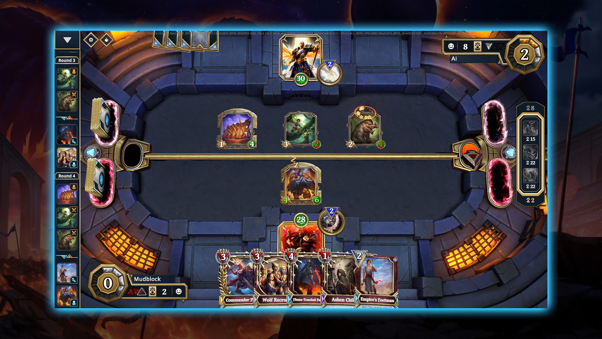
Gods Unchained (2022-2025)
On Gods Unchained, I focused on creating clear, engaging UI/UX for in-game systems while also designing experiences that helped deliver narrative and lore in a way that felt integrated and meaningful to players.
Immutable (2022-2025)
I joined Immutable to work on UI/UX across a range of Web3 games, collaborating with cross-functional teams using Unity and Unreal Engine. The role provided the opportunity to learn from and work alongside industry veterans with backgrounds at studios like Blizzard, Riot, and Ubisoft.

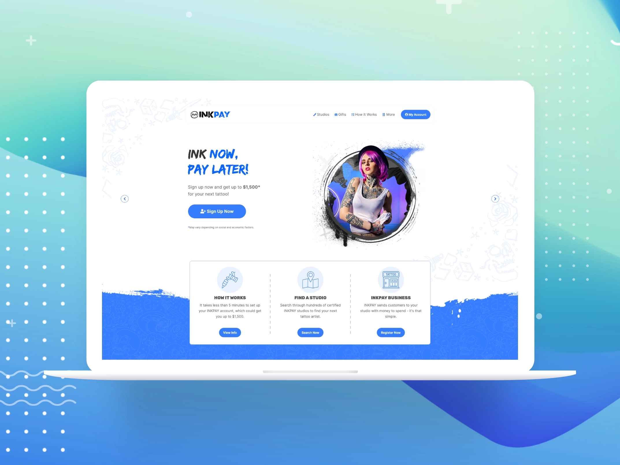
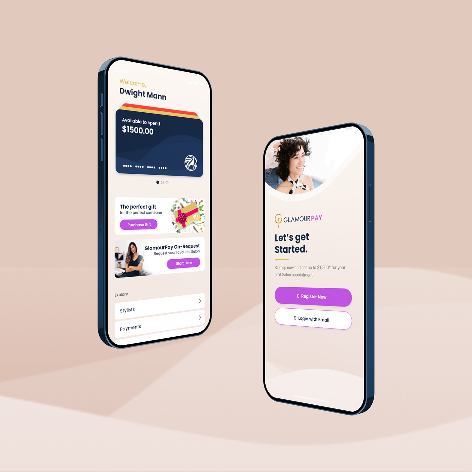
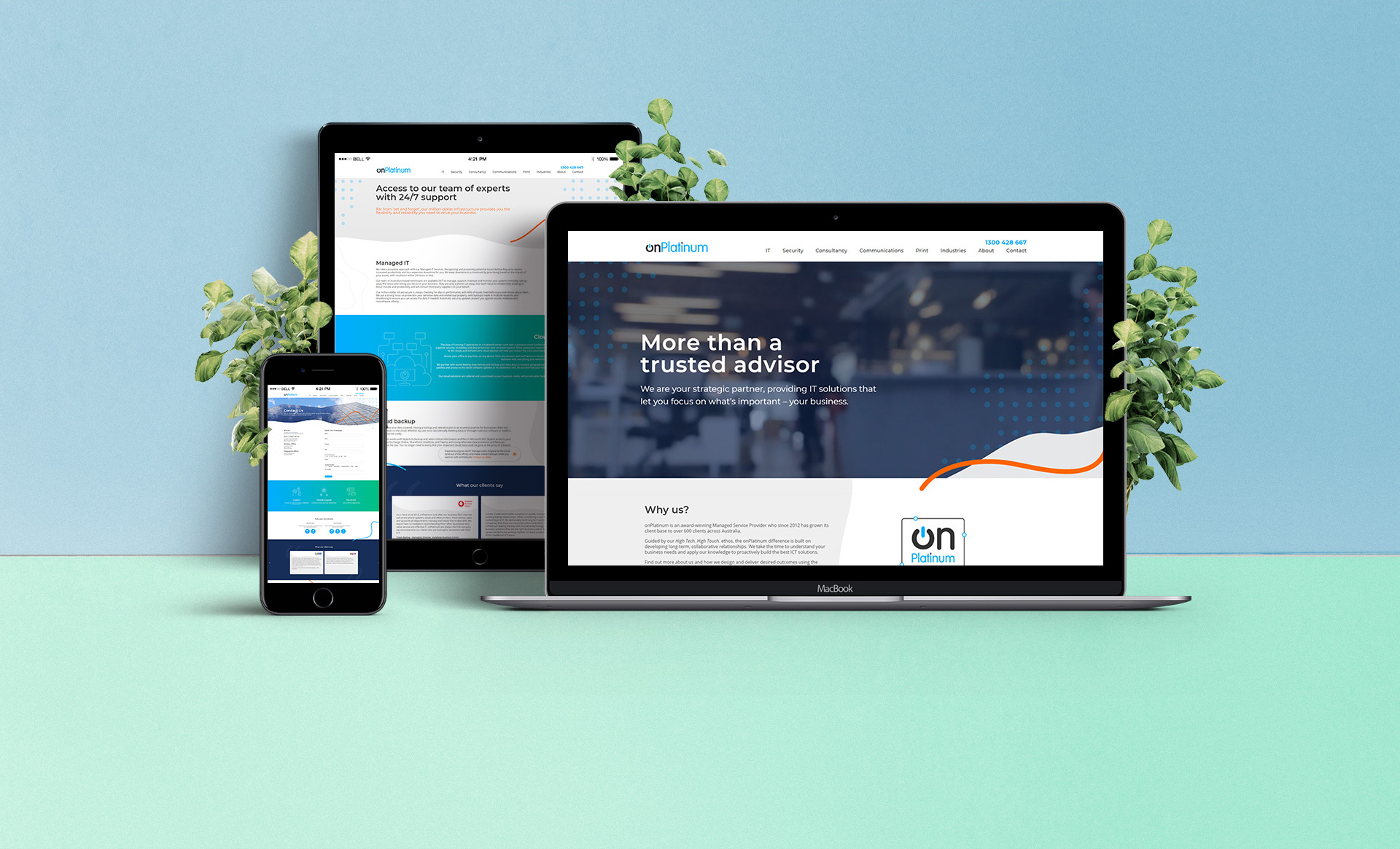
OnPlatinum and Early Career (Pre-2022)
I began my career at OnPlatinum as a Junior UI/UX and Graphic Designer, where I worked across websites, logos, and marketing materials. Over several years, this role built a strong foundation in visual design and usability, before I moved on to projects focused more heavily on UI/UX for apps and web platforms.